There are literally thousands of images residing in hundreds of galleries on hundreds of web sites that are (almost) without exception beautiful pieces of photographic art, and I applaud the authors for their creativity.
However, some photo communities do not accept HDR images into their group, preferring to feature only images that are a clear, detailed and attractive result that still looks “real” after post camera processing, without the “overcooked” look of many HDR images.
Also, sometimes I do not want my final image to be an obvious HDR image.
1. Get the tonal values right first.
2. Adjust colour balance to be as accurate as possible.
3. Improve contrast so that it not only looks good but also takes into account the printing process to be used in reproducing the image. For me, processing digital images has to follow these steps in that sequence.
By experimenting, I have found I can use the HDR technique as a TOOL for recovering tonal values, colour balance and contrast, in an image – so that it reflects what I saw at the time of making the image.
I then finish off my processing in Photoshop to ensure the scene looks ‘real’ without strange colour casts, excessive halos or the HDR ‘overcooked’ look.
For other photographers wanting to achieve similar results, here are the steps I go through, using HDR as a tool - the means to an end, rather than the end result itself.

Image 1. I have deliberately chosen this poorly exposed and composed image to demonstrate the process, not to suggest that it is a great image. This is exactly how it came out of the camera, captured as a raw file. We all have bad days from time to time
Image 2. The raw file processed via Lightroom to achieve better tonal range, better colours and contrast, straightening and better cropping.

Images 3, 4 and 5. The Lightroom file, saved as tif files in -1 EV, 0 EV and +1 EV ready for bracketing and tone-mapping in Photomatix v3. (Photomatix v3 gives more flexible control and subtle results than v2 and is a free upgrade for v2 owners.)
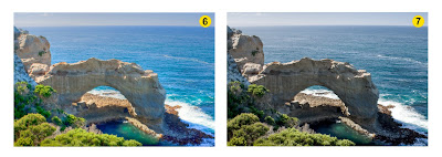
Image 6. The ‘default’ Details Enhancer result from Photomatix. Close to what we might normally expect a HDR image to look like.
Image 7. The same ‘default’ result with strength, colour saturation, luminosity, contrast, light smoothing, temperature and tone settings adjusted.
The aim of these adjustments is to achieve a more natural looking result whilst gaining clarity, contrast and definition in both the highlight and shadow areas. Definition that was not present in the original raw file.
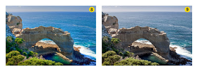
Both of these colour results would be acceptable final images whether you are, or are not, a devotee of HDR as a photographic technique.
I usually find that this process will give me better looking images more quickly than solely processing an image in Photoshop to achieve similar results.
Please feel free to comment on this alternative use of HDR.
No comments:
Post a Comment