Search This Blog

Tuesday, 28 June 2011

Photography Tips, Essential Skills, Quickly Transform Your Photos

This video explains four different light sources and how to use them effectively, as well as using only natural light and a reflector to shoot great portraits. It's about 10 minutes long but well worth spending the time on it.

Click on the heading to view video.


Sunday, 26 June 2011

Landscape photography weekend course at TAFE

TAFE is offering a weekend landscape photography course in October. Click on the post title for more details

Monday, 20 June 2011

Using HDR as a means to an end – when you don’t want the HDR look.

There are literally thousands of images residing in hundreds of galleries on hundreds of web sites that are (almost) without exception beautiful pieces of photographic art, and I applaud the authors for their creativity.

However, some photo communities do not accept HDR images into their group, preferring to feature only images that are a clear, detailed and attractive result that still looks “real” after post camera processing, without the “overcooked” look of many HDR images.

Also, sometimes I do not want my final image to be an obvious HDR image.

After 45+ years reproducing images in all sorts of print media a few basic lessons have stuck with me:

1. Get the tonal values right first.
2. Adjust colour balance to be as accurate as possible.
3. Improve contrast so that it not only looks good but also takes into account the printing process to be used in reproducing the image. For me, processing digital images has to follow these steps in that sequence.


By experimenting, I have found I can use the HDR technique as a
TOOL
for recovering tonal values, colour balance and contrast, in an image – so that it reflects what I saw at the time of making the image.
I then finish off my processing in Photoshop to ensure the scene looks ‘real’ without strange colour casts, excessive halos or the HDR ‘overcooked’ look.

For other photographers wanting to achieve similar results, here are the steps I go through, using HDR as a tool
- the means to an end, rather than the end result itself.

Image 1. I have deliberately chosen this poorly exposed and composed image to demonstrate the process, not to suggest that it is a great image. This is exactly how it came out of the camera, captured as a raw file. We all have bad days from time to time

Image 2. The raw file processed via Lightroom to achieve better tonal range, better colours and contrast, straightening and better cropping.

Images 3, 4 and 5. The Lightroom file, saved as tif files in -1 EV, 0 EV and +1 EV ready for bracketing and tone-mapping in Photomatix v3. (Photomatix v3 gives more flexible control and subtle results than v2 and is a free upgrade for v2 owners.)

Image 6. The ‘default’ Details Enhancer result from Photomatix. Close to what we might normally expect a HDR image to look like.

Image 7. The same ‘default’ result with strength, colour saturation, luminosity, contrast, light smoothing, temperature and tone settings adjusted.

The aim of these adjustments is to achieve a more natural looking result whilst gaining clarity, contrast and definition in both the highlight and shadow areas. Definition that was not present in the original raw file.


Images 8 and 9. Images 6 and 7 respectively, finished off with further minor tone adjustments and sharpening applied in Photoshop.

Both of these colour results would be acceptable final images whether you are, or are not, a devotee of HDR as a photographic technique.

I usually find that this process will give me better looking images more quickly than solely processing an image in Photoshop to achieve similar results.

Please feel free to comment on this alternative use of HDR.

Thursday, 16 June 2011

June Monthly competition results

Set Subject - Urban Landscape

Small print - Open
1st John Culver - Varigated Wren
2nd Roslyn Thomson - Big daddy
3rd John Culver - Sturts Desert Pea
3rd John Culver - Fungi


Small Print - Set Subject
1st John Van de Kolk - DIZ House
2nd Bev Bell - Descending Landscape
3rd Benjamin Spencer - Night House


Novice Small Print
1st Jenny Spencer - Kermit's Wallpaper
2nd Benjamin Spencer - Sunset Beach Walk
3rd Benjamin Spencer - Dog's Eye View


Open Colour
1st Graham Dixon - Launceston Low Tide
2nd Benjamin Spencer - Train Tracks
3rd John Culver - Skipton Lake


Colour - Set Subject
1st John Van de Kolk - Christchurch Arts centre
2nd Les Lockland - A working Day in the City
3rd John Culver - Liebig Street
Highly Commended - Graham Dixon - Hoi An Sunset


Monochromatic - Open
1st Benjamin Spencer - Surf Rescue
2nd Benjamin Spencer - Lighthouse
3rd Roslyn Thomson - Sea the Sea


Monocromatic - Set Subject
1st Benjamin Spencer - Eureka Bee


EDPI
1st John Culver - Athabaska Glacier
2nd John Culver - Frill Necked Lizard
3rd Barry Stapleton - Cape Otway


Creative/ Experimental
1st Benjamin Spencer - Three's a Crowd

Sunday, 29 May 2011

150 Years of Colour Photography

I came across this article in New Scientist. May be of some interest to history buffs. Click on the heading or copy paste the link below

http://www.newscientist.com/gallery/a-century-and-a-half-of-colour-photography

Thursday, 26 May 2011

Competition Results May

Novice Print
1 Jennifer Leddin , Joy
2 Diane Wickson , Fountain
3 Benjamin Spencer , Stand Out !

Small Print (Set Subject)
1 Les Lockland , Dull Globe
2 Les Lockland , Humble Gentleman
3 Benjamin Spencer , Breakwater Lights

Small Print Open
1 Benjamin Spencer , When Sparks Fly
2 Bev Bell , Looking for Tadpoles
3 Roslyn Thomson , Cheetah Club

Colour Print (Set Subject)
1 Roslyn Thomson , Fisherman
2 Benjamin Spencer , Image in the Sand
3 Roger Neal , Autumn on the Pond

Colour Open
1 Roslyn Thomson , Rough Coast
2 Craig Homberg , Misty Dawn
3 Benjamin Spencer , Big -Bigger-Biggest

Monochrome (Set Subject)
1 Diane Wickson , Post
2 Benjamin Spencer , Tomatoes
3 Benjamin Spencer , Chess

Monochrome Open
1 Benjamin Spencer , Drought
2 Bev Bell , Water Reeds
3

Experimental
1 John Vandekolk , 2Faced
2 Benjamin Spencer , Beach Trek
3

EDPI
1 Craig Homberg , Moth
2 Craig Homberg , Girl on Guitar
3 Stan McCullagh , River Scene

Thank you to our judges, John Culver and Lorraine Lee

If any of the winners would like your images posted on the blog, please email me a copy of the file to spjev@bigpond.net.au thanks

Thursday, 21 April 2011

South Western Interclub 2011 Results

South Western Interclub 2011 Results
(click on image to enlarge)

Graham Dixon 2nd Open Colour and 3rd Set Subject Mono
John Culver 3rd Open Colour
Patti Vallance 1st Open Monochromatic and 2nd Set Subject Mono

Thank you to everyone who entered images
Congratulations to Colac Camera Club for winning the overall points total.

Saturday, 9 April 2011

April Competion Results

I don't have a record of who members 50 and 51 are sorry. Let me know or post as a comment.

Novice


1st Benjamin Spencer Birds Of A Feather
2nd
3rd Diane Wickson Cruising Along


Small print Set


1st Benjamin Spencer Flower Of Light
2nd John Culver Star Trails
3rd John Culver Hopkins Falls


Small print Open


1st John Culver Pink Fungi
2nd Benjamin Spencer LOL
3rd Lorraine Lee French Sunflower


Large Print Set


1st Graham Dixon Low Tide
2nd John Culver El Questro Gorge
3rd John Culver Triplet Falls


Large print Open


1st Graham Dixon The 6th W'bool Golf Course
2nd Graham Dixon Port Fairy FF 2011
3rd John Vandekolk Flower show 2011


Monochrome Set


1st Thomas Spencer Ghostly Boom
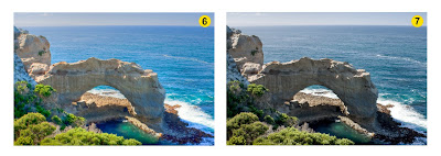
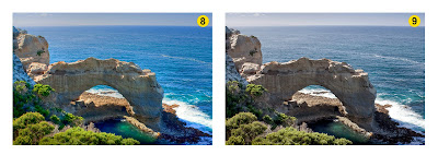
2nd Benjamin Spencer Twelve Apostles
3rd Benjamin Spencer Full Moon


Monochrome Open


1st Benjamin Spencer Hawk
2nd Thomas Spencer Starway to the Sky
3rd Thomas Spencer Jamaican Sheep


Experimental


1st Les Lockland Golden Years
2nd Les Lockland My VW
3rd John Vandekolk No title


projected image Open


1st John Culver
2nd John Culver
3rd Ian Scott

Wednesday, 30 March 2011

Friday, 11 March 2011

A clearer explanation of Hi Pass sharpening

Now that we know a lot more work/experimentation is required for inserting videos into the blog, here's a link (or click on the title) to a very good explanation of Hi Pass sharpening.


(Scroll down to bottom of first page to get to 2nd and 3rd pages)

I've used this method for sharpening most of my prints entered in comps over the past 6 months. No ones commented that any of them look 'over sharp' so it must be an effective method.